
David Macintosh is rather a busy bee. Not only is he the author of Marshall Armstrong is New to Our School, The Frank Show and his latest book Standing in for Lincoln Green, he is also a renowned illustrator and designer and the man behind the design of Lauren Child's books including Clarice Bean and Charlie and Lola.
Here he shares a great selection of top tips for budding illustrators and designers of all ages.
Tip 1 – How to keep ideas:
If I think of something for a book, I'll write it in a notebook. It could be a title I like, or something I overheard on the tube or just an idea that I can build a story around. Often I just carry a story about in my head for ages, working on it in there until I sit down at the laptop or with a pencil to get it going. I find it quicker to play with the ideas using a pencil on paper, than typing on my laptop (see Tip 3).
Tip 2 – Page size:
What size should the book be? Would it be better portrait (vertical) or landscape (horizontal)? Or square? I go to a book store or library and see what books look good. If I see something I like I'll measure it. You don't need an airtight reason for liking it, it might just feel right for your story. But it is very important because it will effect the size and shape of your illustrations.
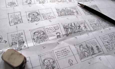
Tip 3 – Storyboard it:
Before you start your artwork, you need to plan things a bit. How will the story work as a physical book? A standard picture book is 32 pages long, so you need to decide where the words will fall throughout the book. I plan the book out, spread by spread, on a big sheet of layout paper. I break the text up where I see good breaks in the story line, and my picture ideas influence where the breaks sit too. It's not as easy as it sounds, but you have to start somewhere. I scribble in ideas of the pictures on these little spreads as I go along. Doing it this way is like taking a bird's eye view of your book and it's a great way of seeing at a glance how the story and illustrations develop across all the pages.
Tip 4 – Make a mini dummy:
It's very useful to see the storyboard in three dimensions. You get a real feel for how the pages turn when you're reading your book and if the breaks you've made are good for the delivery of the story.
At a later stage, I make a dummy at the real size of the book to get a better feel of the end product. It doesn't take long and it's extremely useful when you're pitching it to your publisher too.
Tip 5 – Turn up the contrast:
A busy page with a lot of words on it followed by a page with a tiny ant on it and no words can be very dramatic. Contrast makes things interesting and avoids it being repetitive. Also, a page without text can really create atmosphere. It places all the emphasis upon the picture and the reader is on their own with the information they're getting from that picture. It's very effective and can be used to alter rhythm and pace in the story in different ways. A bit like music in a film.
Tip 6 – Fail and then fail better:
Your first idea isn't always the best idea. The best way I know of deciding what works is to find out what doesn't work. I do many drawings of a composition to see what's not going to work. I then convince myself which is the best of my ideas through the process of comparison.
Tip 7 – Big type:
I like the look of big type especially in contrast to smaller shapes. Letter forms are interesting and graphically pleasing to me, and in obvious ways you can use them to show emphasis in dialogue or scale. I have always admired books with big type. It's useful for when there is a character who has a loud voice or is very small.
Tip 8 – The text and illustrations work hand in hand:
You don't want your pictures working against your words. As your book develops, the picture ideas will influence what you've written, so don't be afraid to make changes. A picture may say something better than the words you've written, so you may find yourself deleting some of the words (if you're illustrating another author's words, it's not always as simple as this!). There's no point repeating in pictures what is already written in the words. Good illustrations extend and enhance the words, not just repeat them.
Tip 9 – Pin it up:
I always blow-up my storyboard and pin it to the wall near where i work so that I can quickly refer to it.
Tip 10 – These are tips, not rules:
Everyone works differently. Some of my books begin with a storyboard then the text is written around the pictures and sometimes I write the story first. But I can never not be thinking of the pictures when I'm writing words and vice versa. It just doesn't happen. I'm also thinking about the type of paper, and the typeface (font) and layout I think will work simultaneously. As a picture book author, I present my ideas to the publisher as a dummy book, words and pictures together, like a book. So, nobody sees the words separately to my picture ideas which is how I want it. It's only a picture book when the words are involved with the pictures.
So see what works best for you.
Do you have a review to share, or your own stories or book designs? If you aren't a member already join the Guardian children's books site and then email us your gems at childrens.books@theguardian.com.
