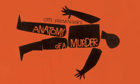
The 1950s in America are widely regarded as an era of dull conformity. In fact this was a period of considerable liveliness and innovation. The books that fuelled the revolution of the 1960s – The Organization Man, The Power Elite, The Hidden Persuaders, The Affluent Society – appeared in this decade, as did Ginsberg's Howl and Kerouac's On the Road. In the visual arts the Modern Movement achieved serious popular acceptance, spreading out from the galleries into everyday life through the work of graphic designers. Among the most notable of the latter is the fascinating subject of this sumptuous book, the prolific Saul Bass, who became famous, influential and a source of universal pleasure through what was virtually a sideline, his groundbreaking credit titles for Hollywood movies, starting in 1954 with Otto Preminger's Carmen Jones.
Bass was born in the largely Jewish New York borough of the Bronx in 1920 to working-class Russian-Jewish immigrants, who encouraged his early interest in and flair for the arts. Growing up in the Depression, he had to leave school at 16 to work in an advertising agency, attending art classes in the evening. One of his early assignments was churning out posters for Warner Brothers movies; 36 years later he designed the new worldwide logo for Warner Communications.
The decisive influence came in 1944 when the great Hungarian émigré designer, theorist and Bauhaus devotee György Kepes, then teaching in Brooklyn, became his mentor. Kepes focused Bass's ideas about modernism, psychology and the social responsibility of designers, and he was to become one of the most articulate members of his profession, a man who did pro bono work for organisations such as the Girl Scouts of America, Human Rights Watch and the Special Olympics, and was later to say: "The ideal trademark is one that is pushed to its utmost limits in terms of abstraction and ambiguity, yet is still readable. Trademarks are usually metaphors of one kind or another. And are, in a certain sense, thinking made visible."
In 1946 Bass was invited to join a major advertising company in Los Angeles whose accounts included TWA and Paramount. His career rapidly took off in a city that was emerging as a vital centre of modernism in architecture and design, awash with rich clients and sponsors. Soon he was doing chevrons for aircraft tails, posters for Chaplin's Monsieur Verdoux, covers for Art & Architecture and LP sleeves such as the classic Tone Poems of Color for Sinatra. He became a regular participant in conferences on design, expounding his beliefs, originally inspired by the Arts and Crafts movement and the Bauhaus, about the way society could be transformed ethically by the aesthetic improvement of the environment.
In photographs from the 1950s the cheerfully serious Bass, with his open moon-face and horn-rimmed spectacles, looks like his Bronx contemporary, the playwright Neil Simon. He was obviously looking for a more creative outlet for his talents than the lucrative commissions for trademarks, corporate logos, letterheads, TV commercials and packaging for which he was in constant demand. The answer proved to be film-making: imaginative documentaries, a single feature film (the rarely seen SF picture Phase IV, made in Britain in 1974), and pre-eminently title sequences for other directors' work on which he sometimes received the credit of "visual consultant".
In this his collaborator was to become his second wife, Elaine, a fellow New Yorker seven years his junior who'd sung in an Andrews Sisters-style group with her older sisters before turning to commercial art and relocating to Hollywood. She'd met Saul around the time he created Saul Bass & Associates in 1956, married him in 1961 and worked with him until his death in 1996. This superbly designed book, with its 1,480 illustrations, is a work of filial piety on the part of their daughter Jennifer Bass, herself a graphic designer, in collaboration with the design historian Pat Kirkham.
Roughly half the book is devoted to cinema, the most interesting part concerning the film titles of which there are an astonishing 70 examples. The earliest are from a time when the major studios, then in decline, had little interest in titles. Fortunately, directors such as Preminger (with whom Bass worked on 13 pictures), Wilder and Hitchcock were gaining personal power and saw new ways of enhancing their work. In 1960 alone, Bass did the titles for Exodus, Psycho, Ocean's 11 and Spartacus.
His hand could be discerned virtually everywhere – opening titles, epilogues, advertising, posters, trailers, the accompanying record sleeves, and as with his other work, he captured, summed up and expressed the essence of the picture in resonant images. As the authors of this book perceptively put it: "In all his work Saul said that he 'looked for the simple idea'. But Saul's work in film was about more than just simplicity. His designs shaped complex ideas into radically simple forms that offered audiences a set of clues, a sort of hermeneutic key to deeper meanings under the surface of the movie."
Each film project is individually analysed, though there are recurrent motifs, among them flames, detached limbs, globes, eyes and grids, and the title sequences for Preminger's The Man With the Golden Arm and Anatomy of a Murder are etched on the minds of several generations of moviegoers. As visual consultant, his role has also been the subject of controversy, most significantly over the shower sequence in Psycho, which many now see as substantially, though not entirely, Bass's work.
Bass had done no titles for more than a decade when an admirer, Martin Scorsese, called from out of the blue in 1990 on the off-chance that he might work on Goodfellas. It was a quick, simple job, and there followed three further Scorsese assignments, each offering Saul and Elaine a free hand, and with Cape Fear, The Age of Innocence and Casino, Bass went out in a blaze of glory.

